
English
Eng

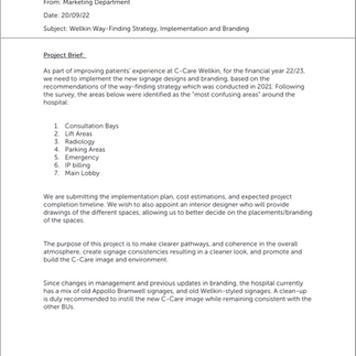
Redesigning the Patient Journey at C-Care Wellkin
The OPD wayfinding project at C-Care Wellkin was launched to address a critical challenge in patient navigation. With 73% of patients reporting difficulties in finding their way, the hospital needed a cohesive system that merged clarity, branding, and patient comfort. By transforming survey insights and design guidelines into a fully realised signage and interior redesign project, we created an environment that not only simplified navigation but also enhanced the patient experience and reinforced the C-Care brand identity.
My Role
I led the end-to-end project, reporting directly to the COO. My responsibilities included:
Translating the wayfinding guidelines into a patient journey signage plan.
Designing the signage matrix (types, functions, placements).
Preparing supplier tender matrices and CAPEX submissions for CEO approval.
Coordinating multiple suppliers (signage, painting, carpentry).
Presenting progress to the Patient Experience Steerco.
The Team
Me: Marketing Coordinator — project lead and link between design, operations, and C-suite.
COO: Project sponsor and decision-maker.
Interior Designer: Visualised proposals for board approval.
Signage Supplier: Fabricated and installed signage.
Painting Supplier: Executed new wall colour schemes.
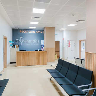
Carpentry Contractor: Redesigned reception desks with timber battens.
Procurement & Finance Teams: Supported tendering and CAPEX process.
Timeline
September 2022: Project brief and guidelines shared.
October–November 2022: Supplier tendering, matrices, interior design proposals.
December 2022: CAPEX submission and CEO approval.
January–April 2023: Execution (painting, carpentry, signage installation).
May 2023: Project completion and impact assessment.
The Challenge
C-Care Wellkin had just emerged from a rebrand, but its spaces still carried the weight of history: old Apollo Bramwell signs, remnants of the “Wellkin by C-Care” identity, and a patchwork of interim solutions. The result was confusion. A survey commissioned externally confirmed what patients and staff already felt: 73% of patients struggled to find their way, often guessing through corridors, while 80% of staff admitted they spent valuable time guiding lost visitors. The Outpatient Department (OPD) — one of the busiest touchpoints of the hospital — was selected as the pilot zone to prove that wayfinding could become a cornerstone of patient experience.


The Beginning
An external consultant had developed a set of wayfinding guidelines for the hospital: nine principles emphasising visibility, intuitive design, decision points, and consistency. It was a well-structured framework, but what it lacked was translation — turning design philosophy into something a first-time patient could follow while feeling welcomed and reassured. That responsibility landed on me. I was the only marketing representative on the ground at Wellkin, reporting directly to the COO, and was tasked to lead the OPD wayfinding project from end to end.


From Guideline to Blueprint
I began by walking the patient journey step by step: from the entrance to the lift lobby, from the waiting bays to radiology. Each corridor, junction, and desk became a touchpoint in a much larger story. I created an Excel matrix of more than a hundred signage elements, categorised into identification, directional, informational, regulatory, and health & safety functions.
But a spreadsheet wasn’t enough to convince executives. So I partnered with an interior designer, who helped me transform the plan into visual renders. This was crucial — it gave the C-suite a clear vision of what the new OPD could look like, not just in terms of wayfinding, but in the atmosphere we were trying to create: calmer, warmer, and unmistakably branded.
Making the Case
To move forward, I needed approval for a significant capital investment. I authored a detailed CAPEX proposal of Rs 4.2 million for the signage system, with an additional Rs 800,000 for reception refurbishments.
To ensure transparency and rigour, I conducted comparative analyses of suppliers across signage, painting, and carpentry. Each was evaluated not only on cost, but on product quality, track record, and ability to deliver within hospital constraints. The proposal went through the full chain of approvals — from the Financial Controller to the COO, CFO, and finally the CEO — before being signed off as a 10-year infrastructure asset.
For me personally, this was a turning point: my name and justification were written into the CAPEX documents, making me directly accountable for one of the hospital’s largest patient-experience investments.


Execution Under Pressure
Hospitals don’t stop running for projects. Every decision had to be timed to minimise disruption.
Carpentry works for the timber-batten reception desks were scheduled at night.
Corridor painting took place during quieter hours.
Signage installations were staggered during the day, ensuring patients could still navigate while works were ongoing.


Each step required coordination across suppliers, health & safety officers, and the operations team. I also validated every colour and design with the head office’s senior graphic designer to ensure alignment with C-Care’s visual identity.
The Transformation
Four months later, the OPD had been completely redefined.
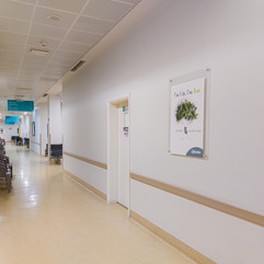
Before: A dated reception desk, fragmented signage, corridors where patients relied on instinct more than guidance.
Proposal: Clean, modern renders showing timber details, simplified signage hierarchy, and intuitive wayfinding.
After: A harmonised environment where signage was clear, desks were welcoming, and patients could move with confidence.
Impact:
Reduced reliance on reception staff for guidance.
Clearer, calmer atmosphere in waiting areas.
C-Care’s brand identity finally embedded within the OPD journey.
Patients reported a more positive and stress-free experience.


After the Transformation
The OPD project proved the value of systematic wayfinding, but it also revealed that transformation is never finished.
Challenges that remained: Doctor chamber attributions were inconsistent, errors in displayed doctors’ lists needed correction, and technical terms like PACS or consultation areas required simplification for patient understanding.
Next priorities identified: Extending wayfinding to external parking signage, room numbering, branding of waiting areas, lift lobbies across all floors, main lobby renovations, and the ophthalmology centre on the third floor.
Recommendation: Commission Glam, the original survey partner, to conduct a post-project audit to measure improvements and quantify impact against the original 73% dissatisfaction rate.
In other words, the OPD became both a proof of concept and a launchpad for a hospital-wide redesign of the patient journey.

Reflection
This was my first real immersion into the world of wayfinding and environmental branding. I learned that signage is never just about arrows and boards — it’s about psychology, reassurance, and trust.
It taught me how to translate strategy into action: to take survey data and design guidelines, transform them into matrices and visualisations, defend them at the CEO’s table, and finally orchestrate suppliers to make them real.
More than a project about signs, this was about patient experience as brand — and the power of design, operations, and strategy working together to shape how people feel in a place.
If you’d like to connect, collaborate, or simply exchange ideas, feel free to get in touch.


